

Sunday, 22 November 2009
Preserving time
I am looking at the concepts of packaging time and selling time, I took this and got two panels of clear perspecs to press leaves in between,to preserve the "time and colour"that the leave indicate by using tape to seal the 2 panels air tight to not allow decay.


Experimenting with new material
Using PVA glue,leaves,cling film and weights I pressed leaves,seaweed and grass,cut them into panels as a way of using the "time indicator through nature" idea after thinking about recycling and packaging as a way to investigate a possible material I could use.Packaging time using a time indicator as a material as well as preserving the colour in the material.


Post it video
In terms of limitations,like with the stop motion it shows just what can be done only using post its.
Green genius
This was something that interested and encouraged me to think more about sustainable packaging and recycling as an option for a packaging concept?
Designed by Hub Strategy | Country: United States
“In designing this packaging, we focused on a couple key things 1) make it as environmentally friendly as humanly possible, we did so by using 100% recyclable craft board that is 60% post consumer waste and printing with UV inks to make as little impact on the Earth as possible. And 2) design a trash bag package that is actually nice to look at. This included the obvious Glad/Hefty burst, bevel and glowing color madness as well as not falling into the classic “green” pitfalls we all know (i.e. a forest background and a leaf-inspired logo).
With these things driving the design, we created a line of packaging that feels high-quality and pops off the shelves because it sits back”

Designed by Hub Strategy | Country: United States
“In designing this packaging, we focused on a couple key things 1) make it as environmentally friendly as humanly possible, we did so by using 100% recyclable craft board that is 60% post consumer waste and printing with UV inks to make as little impact on the Earth as possible. And 2) design a trash bag package that is actually nice to look at. This included the obvious Glad/Hefty burst, bevel and glowing color madness as well as not falling into the classic “green” pitfalls we all know (i.e. a forest background and a leaf-inspired logo).
With these things driving the design, we created a line of packaging that feels high-quality and pops off the shelves because it sits back”

Interesting die cut packaging
Designed by Schneiter Meier Külling | Country: Switzerland
Unique packaging for Swiss based food retailer Migros. The very simplistic design is nicely detailed by the use of unique die cutting to show the product as the fill for the image/text.

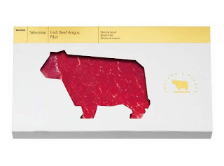
Unique packaging for Swiss based food retailer Migros. The very simplistic design is nicely detailed by the use of unique die cutting to show the product as the fill for the image/text.


Subscribe to:
Posts (Atom)